A testimonial should be as long as the slot that will display it: a dozen words beside a signup button, about thirty in a wall card, up to fifty for a hero quote, and hundreds only in a case study. Pick the slot first and collect to its budget, and every quote you get back arrives ready to use.
The published advice disagrees with itself, and that is the answer
Search the question and you get two confident numbers that cannot both be right. Orbit Media’s guide to writing testimonials says flatly: “We recommend 30-50 words total.” StrongTestimonials, writing on the same question, says “at most, your ideal testimonial length should be two or three paragraphs long” — somewhere between a hundred and two hundred words, or four times the first answer.
Neither is wrong. They are measuring different containers. Thirty to fifty words is a quote set large on a page, where every word costs screen area. Two or three paragraphs is a dedicated testimonials page read top to bottom, which is a page almost nobody reads. The useful version of the question is not “how long should a testimonial be” but “where will this quote go?” — and the layout patterns for displaying testimonials are the map of the answers.
A wall card shares a column with eight neighbours and is skimmed, not read. A hero quote is set in large type. A quote beside a call to action gets the same single glance as the button it supports. Each of those spaces grants a number of words, and that number is the budget the quote has to live inside.
Word budgets by slot
The budgets below are judgment calls from working with these layouts, not laboratory results, and the reasoning column is the part worth internalizing: each number comes from how the slot is read, or how it breaks.
| Slot | Budget | Why |
|---|---|---|
| Inline beside a call to action | One sentence, ten to twenty-five words | It is read in the same glance as the button; a second sentence goes unread |
| Wall or grid card | Fifteen to forty words | Cards sit in columns, and one long card towers over its neighbours |
| Compact badge or strip | About three lines before it clamps | Compact layouts cut the text off; words past the clamp are invisible |
| Hero quote | Thirty to fifty words | Large type needs one specific claim with room to land, and nothing else |
| Carousel slide | Same as a wall card | A slide is a card that also has to survive being rotated past |
| Case-study copy | A few hundred words, kept whole | A reader who chose the page will read a story, not a caption |
One consequence is worth stating plainly: the budgets for every persuading slot sit between roughly ten and fifty words. Finding those spots on your own site is a short exercise, and the five slots worth filling first are not the ones most placement advice lists. If the testimonials you collect routinely arrive at two hundred words, the mismatch is structural, and no amount of careful editing fixes it as well as collecting differently would.
Put a hundred-and-fifty-word answer in a wall card and the card becomes a tower that unbalances the grid. Put it in a hero slot and the one specific line that earned the placement gets buried in texture nobody reads. Put it beside a call to action and you have answered a glance with an essay.
A budget is a ceiling, not a target
Don’t trim every quote to its slot’s budget and publish the result. A set of quotes that all land at the same length in the same register is one of the signals readers have learned to read as manufactured — why real testimonials look fake covers that tell in detail, and the summary is that curation removes exactly the unevenness that proves the words came from different people.
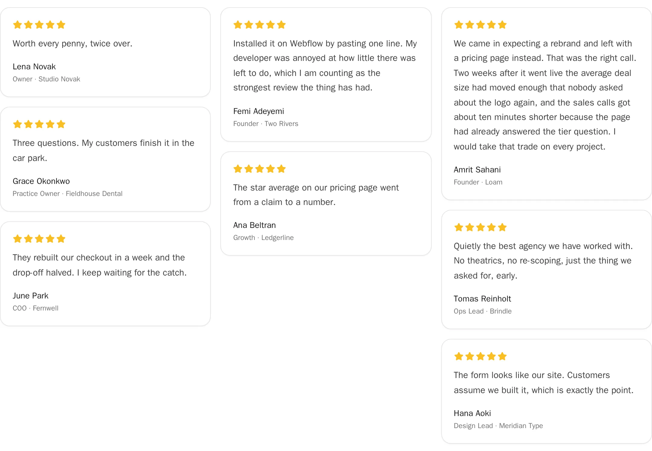
The budget tells you when a quote is too big for a slot. It never tells you a shorter quote needs inflating, or that a twelve-word card is a problem sitting next to a forty-word one. Treat every number in the table as the point where a quote stops fitting, not the length to aim for.
Length does have one mechanical cost, and it is smaller than it sounds. A testimonial embed ships its quotes as text, so a wall of thirty long ones weighs more on the wire than a wall of thirty short ones — a few kilobytes, against embeds we measured between 6.7 KB and 476 KB for the same job. Architecture decides that number. Your word budget does not, and no good sentence should be cut for it.
Collect two lengths, and nothing needs cutting
A customer asked for “a testimonial” sends one block of text at one length, and that length is usually wrong for every slot you have. Ask for two lengths instead: one short field that produces the compressed version, and one open field that produces the full story. It costs the customer about ten extra seconds and saves you every editing pass afterwards.
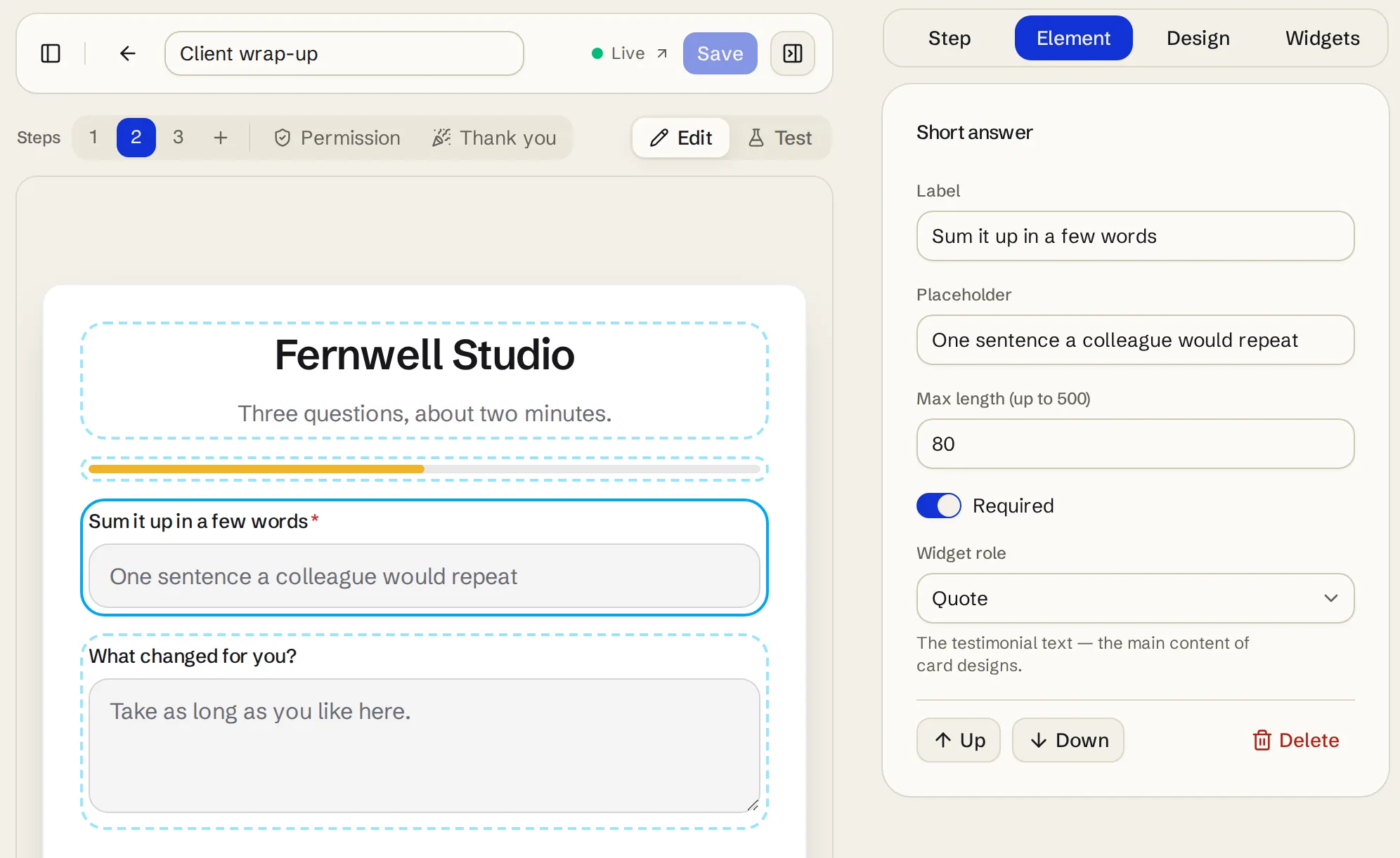
The short field is a compression question — “sum it up in a few words”, or “how would you describe us to a colleague, in one sentence?” People write tighter when the field is visibly small, and the answers arrive quotable. The open field is the outcome question, answered at whatever length the customer’s story needs. Which wordings produce which ingredients is the subject of testimonial questions to ask customers; the point here is narrower. When the form collects both lengths, every slot on your site draws from a field that already fits it, and nothing has to be cut down — including the tighter excerpt a feed post wants. The form stays a short task despite the extra field, and the message around the link still decides whether it gets opened at all, which is covered in how to ask for a testimonial.
Set the cap in characters, because that is what a field counts
Form fields are capped in characters, not words, so the budget needs converting. Peter Norvig’s count over the Google Books corpus puts the average English word at 4.79 letters; add the space after it and a character cap divides by roughly 5.8. Eighty characters is about thirteen words. Two thousand is about three hundred and forty.
Set the summary field’s cap to your tightest slot’s budget and the constraint does its work while the customer is still writing, which matters because the cap is the only length control that operates before the words exist. Most form builders in the testimonial software category can cap a field; Testymo’s product review template ships the pattern directly, pairing an eighty-character “Sum it up in a few words” field with an open review field below it.
Everything that happens after the words arrive is a weaker tool. Trimming by omission is legitimate; rewriting for length is not, and anything past tidying should go back to the customer for approval before it is published. The working order looks like this:
[ ] Pick the slots your pages actually need, using the placement map.
[ ] Give the form two answer fields: a capped summary and an open story.
[ ] Set the summary field's character cap to the tightest slot's budget.
[ ] Publish what arrives. Trim by omission only; send bigger edits back for approval.
Video runs on a different clock
Much of the advice published under this question is about video rather than text, which is worth knowing before you borrow a number from it. StrongTestimonials puts the target at “under two minutes, with a cut time of 60 to 90 seconds being preferable”, and that range says nothing useful about how many words belong in a wall card.
The slot logic does carry over, though. A clip embedded mid-page is interrupting something and earns a shorter budget than one on a page the visitor deliberately opened, in exactly the way an inline quote earns less room than a case study.
Where the long answer belongs
A two-hundred-word answer is not a failed testimonial. It is the raw material the short slots cannot use and the long surfaces are starved for: case-study copy, the supporting detail under a feature claim, the story a prospect reads after the wall card got their attention. The specifics that make a long answer unusable in a badge — the numbers, the before and after, the named hesitation — are precisely what those surfaces need, so keep it whole rather than mining it for a sentence and discarding the rest.
Publishing it unshortened is also the honest default at the display layer. Testimonial widgets mostly render whatever you approve, so a three-hundred-word quote published into a wall becomes a three-hundred-word card. The length a visitor sees is a decision you make at collection and curation time, not something the display will quietly fix for you.